• Works
    • Interiors
    • 3D
    • 2D
  • About
  • Contact
◀ ▶
P a p a g a y o B e a c h (Curacao)

Project title:  Papagay Beach Resort Curacao
Category:  
Super Sized Artwork for Wall & Curtains

Material & Process: Large Scale Print
Year of design: 2014


Brief:   

◀ ▶
T r o p i k i t a

Project title: Tropikita
Category: Corporate Identity design and Branding
Material & Process:  Corporate Identity Artwork.
Year of design: 2012


Brief:  To design create a concept for a new international brand of bananas and to include a fruit stickers and packaging design to utilise the latest available innovations in printing packaging for produce.

Comments: Typically screen printing had been used for this type of packaging however at the time of the project new printing technologies became available which allowed me to experiment with gradients, a effect previously unobtainable. Evidently I had a lot of fun with this! For the logo I decided to create a fun character which people could associate with hi quality fresh produce. The natural selection was a colourful charismatic Monkey. The tropical style typography was an in-house project creating both solid and outline versions both of which appear to float loosely above one another.

◀ ▶
P r o m o t i o n a l C a r W r a p s

Project title:  Company Cars
Category:  Promotional Car Wraps
Material & Process: Proposal for Racing Team Graphics.
Year of design: 2019


◀ ▶
F l o r R e a l

Project title: Flor Real
Category: Corporate Identity design and Branding
Material & Process:  Corporate Identity Artwork
Year of design: 2012


Brief:  To design create a concept for a new international brand of bananas and to include a fruit stickers and packaging design to utilise the latest available innovations in printing packaging for produce.

Comments: The Flor Real project was a fantastic project to work on and a real milestone in my career. It was a first in many respects. Taking inspiration from a recent trip to a tropical climate, I decided to design a logo and huisstijl based on the Banana plat itself. Using the natural colours found on banana plantations a even using the sculptural form of the plat itself as the logo. The purple and pink tones are found naturally with the plant which appears to grow both up (at first) and then continues to grow down. This behaviour in the banana plant set the stage for the logo which mimics the downwards trajectory.   

◀ ▶
A d v e r t i s i n g f o r R e v i s e d

Project title:  Monocle Magazine Advertising.
Category:  Advertisement.
Year of design: 2018-19 (Revised).


Brief:  To create a set of visualisations for this archetypal armchair by Studio Job. In true monumental fashion Studio Job had created a unique Labyrinth fabric for the upholstery. Each plane has its own corresponding part of the puzzle which continues throughout the whole design. Creating the visuals for this piece meant hours of labour and a process which didn’t differ too much from the genuine craft of upholstery. 

It’s always a pleasure to work with some of the greatest designers and design labels in the industry and this project for Moooi was no exception.

◀ ▶
P r i v a t e V i l l a (Curacao)

Project title:  Private Villa Curacao
Category:  Artwork & Super Sized Printwork
Material & Process: Large Scale Print
Year of design: 2014


Brief:   

◀ ▶
S u z y H u n t

Project title: Suzy Hunt
Category: Corporate Identity design and Branding
Material & Process:  Corporate Identity Artwork, Hot foil printing.
Year of design: 2013


Brief:  To create a timeless logo and huisstijl for the accomplished interior designer Suzy Vissers-Hunt. To accompany this a decision was made to design a floral composition of her favourite Orchids and a selection of British plants and flowers, our native motherland.

Comments: This was a really great project and Suzy was the perfect client, bringing lots to the table in the way of professional feedback, open-mindedness and comment. For the emblem I decided to create a Door Knocker wrapped and intertwined with geometric vines which are two symbolic profiles of a house. The serif typeface selected was a natural and  long awaited choice for me, designed in the same year by the incredibly talented designer/typographer NachOh!

◀ ▶
C o m p o s t
◀ ▶
M o o o i : 2 0 1 1

Project title: Moooi Salone del Mobile 2011
Category: Promotional material
Material & Process:  Print & Digital media.
Year of design: 2011


Brief:  To create a variety of promotional material for the Salone del Mobile presentation including all printed material, news book and give-away’s.

◀ ▶
F r u i t t e r o

Project title: Fruittero
Category: Corporate Identity design and Branding
Material & Process:  Corporate Identity Artwork
Year of design: 2011

◀ ▶
V i c t o r e Y a c h t s

Project title: Victoire Yachts
Category: Corporate Identity design and Branding
Material & Process:  Corporate Identity Artwork
Year of design: 2011


Brief:  To re-design the logo of an establish luxury yacht building company to coincide with the launch of a new fleet of boats and an overhaul of the company including all stationary and promotional material.

◀ ▶
T h e D i s c o v e r y D e n

Project title:  The Discovery Den
Category:  Branding, Identity, Web Design & Artwork
Material & Process: 
Year of design: 2017


Brief:   

◀ ▶
T h e G r e e n G r o c e r

Project title: The GreenGrocer
Category: Corporate Identity design and Branding
Material & Process:  Corporate Identity Artwork, Hot foil printing.
Year of design: 2011


Brief:  To design and create a brand for an international logics firm specialising in the distribution of produce from South America to the international community. 

◀ ▶
M o z a P r o z a

Project title: Moza Proza
Category: Corporate Identity design and Branding
Material & Process:  Corporate Identity Artwork
Year of design: 2013


Brief:  To design a boarder for a Christian Church school newsletter using only characters from the logo. 

◀ ▶
I n t o I n t e r i o r s

Project title:  The Discovery Den
Category:  Branding, Identity & Super Sized Artwork
Material & Process: 
Year of design: 2016


Brief:   

◀ ▶
R e w i r e

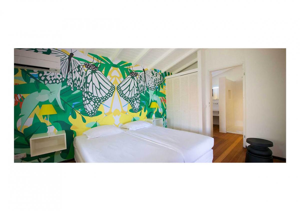
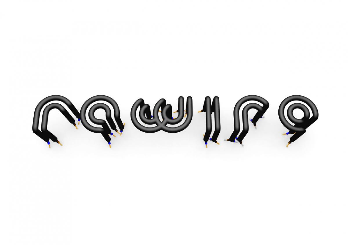
Project title:  Rewire
Category: Corporate Identify/Huisstijl
Year of design: 2012 (CMC Studio)


Brief:  I was asked to create a memorable brand identify for an Electrical firm in the UK.

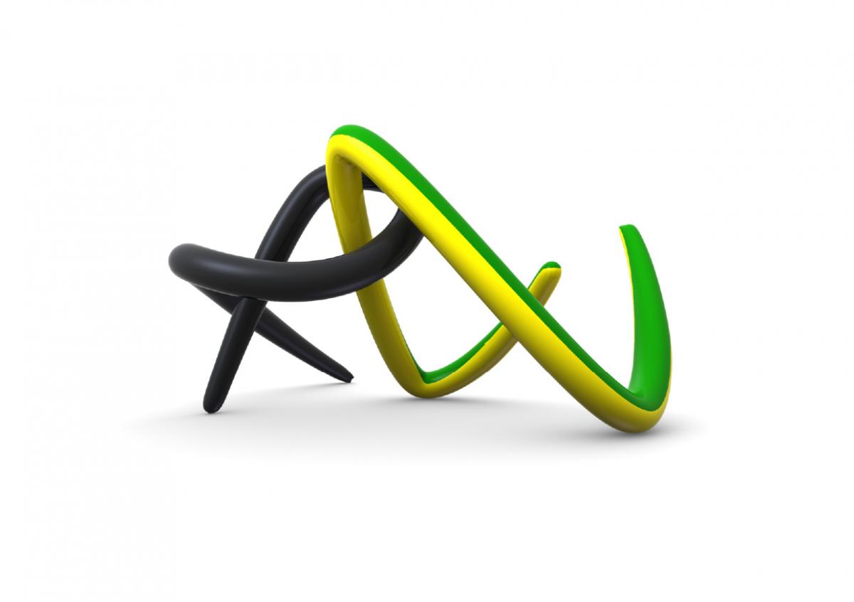
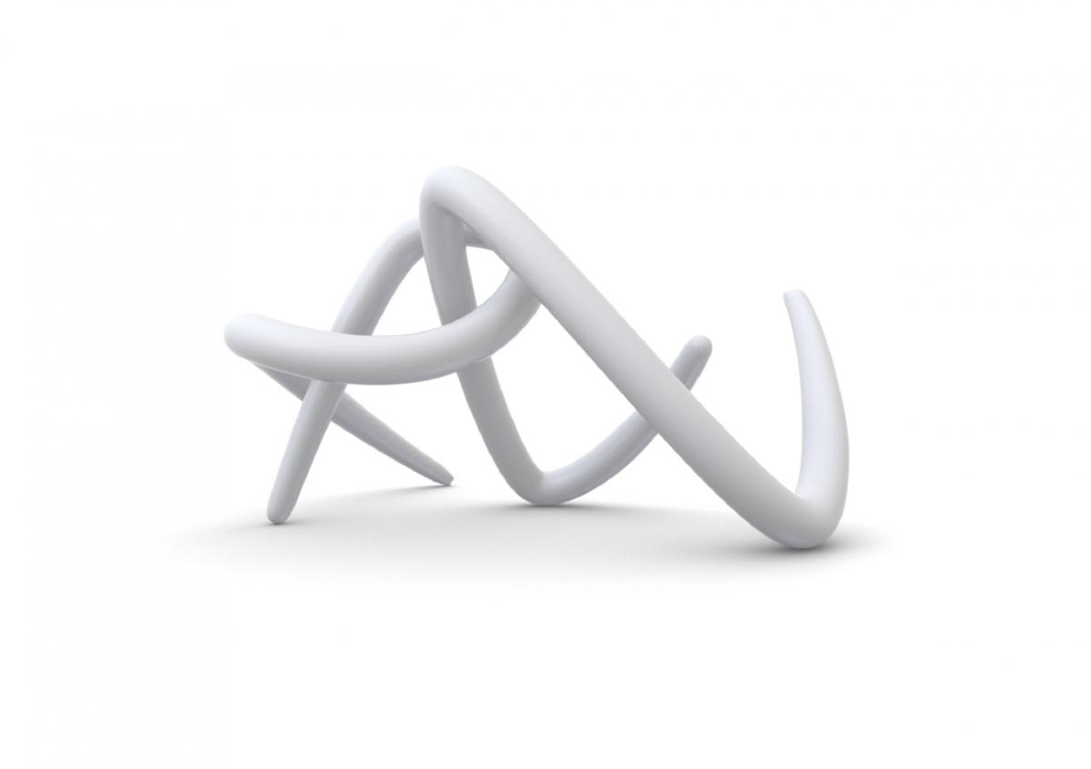
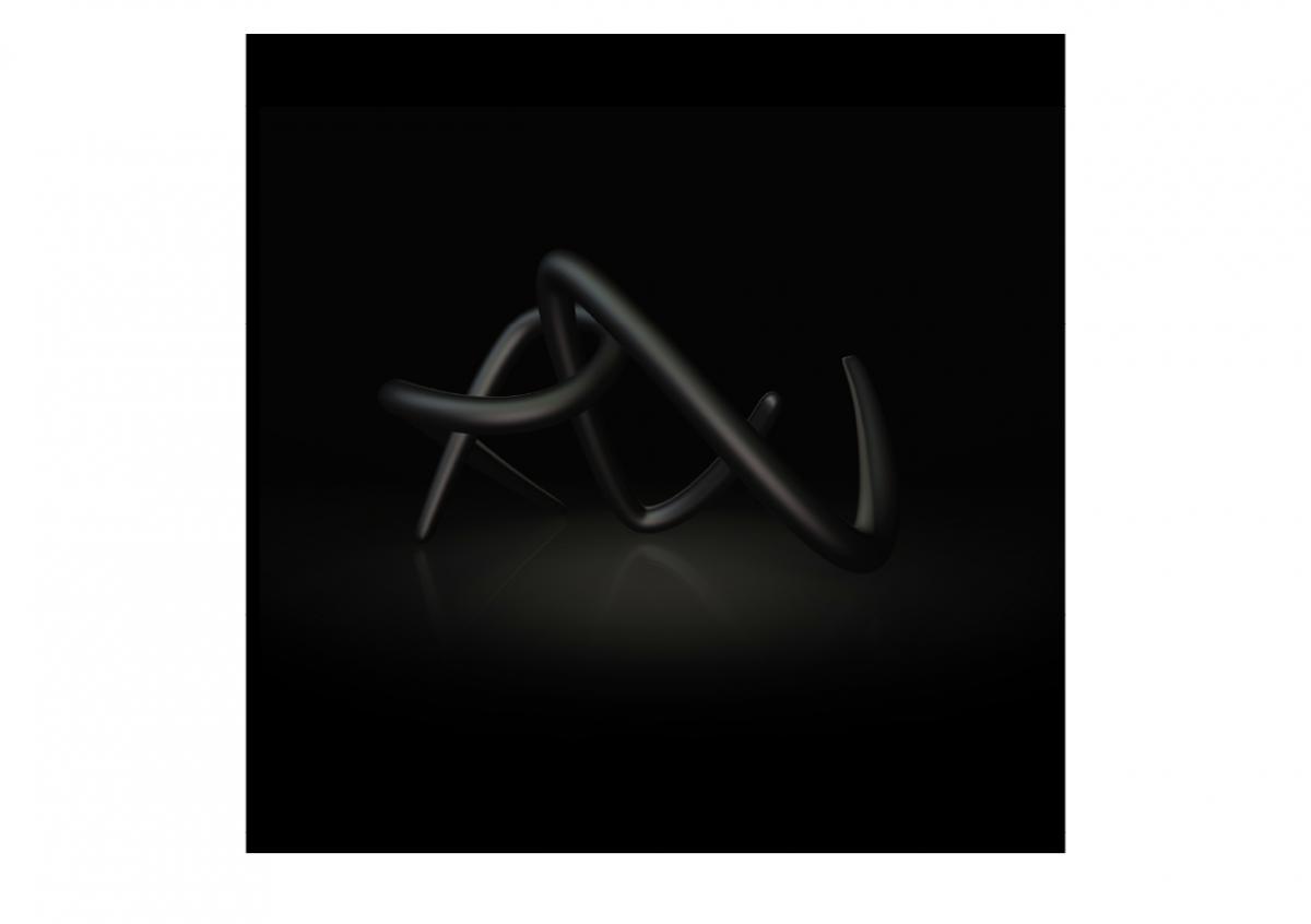
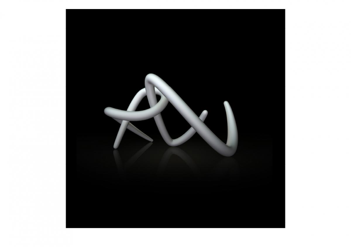
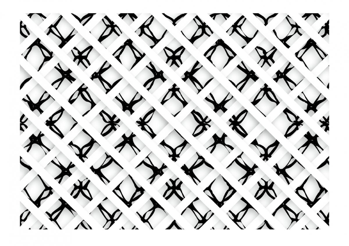
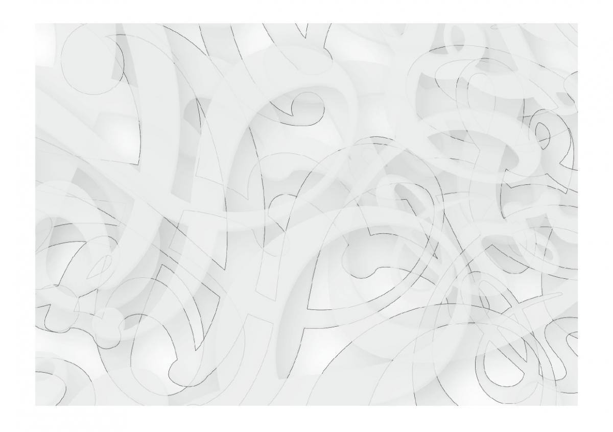
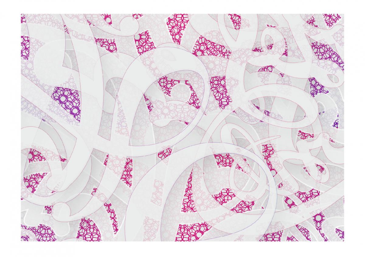
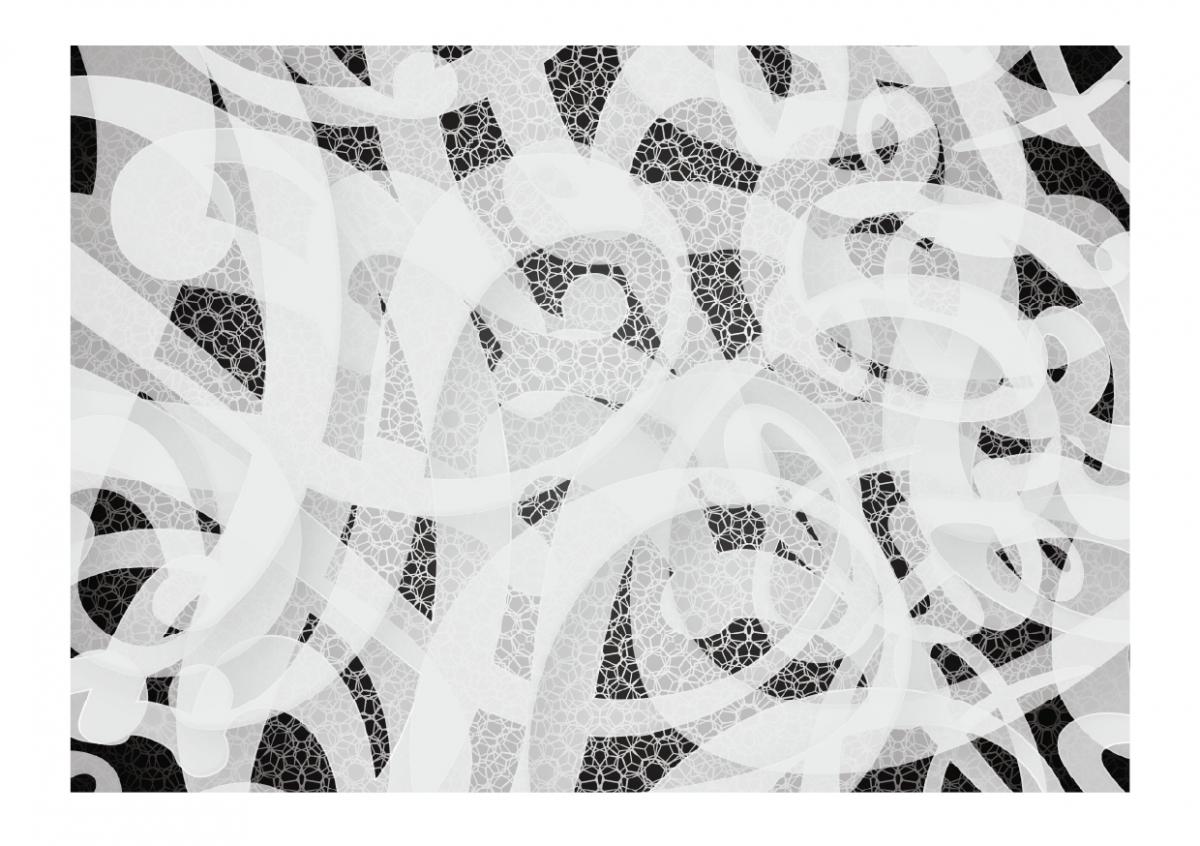
Comments: For the initial stages of this project I decided to work in reverse by starting with the tangible product, working back towards the digital. I started with the very basic core materials used the firm as I thought this would be a great place to find an all encompassing concept which would represent the company and the work they do. This product happened to be electrical cables. After spending hours working with the pliable cables I eventually found the concept, which was to create a unique typography using the cables from different electrical divisions.

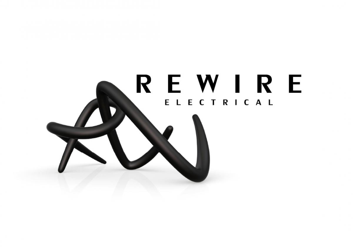
The letter type was then translated into 3d modelling software where materials and a scene were added. Once I had the digital typography the company name ‘Rewire’ was created starting with the full name, then abbreviations eventually settling on the RW emblem accompanied by the word mark Rewire Electrical to make the brand legible and recognisable.

◀ ▶
C o r o n i t a

Project title: Coronita
Category: Corporate Identity design and Branding
Material & Process:  Corporate Identity Artwork
Year of design: 2011/12

◀ ▶
O a k S a p l i n g
◀ ▶
L o f t H a u s

Project title: LoftHaus
Category: Corporate Identity design and Branding
Material & Process:  Corporate Identity Artwork
Year of design: 2011

◀ ▶
G e o w o r k s
◀ ▶
I r i s V i r u s
◀ ▶
L a c e w o r k s
▼ ▲